ICEG
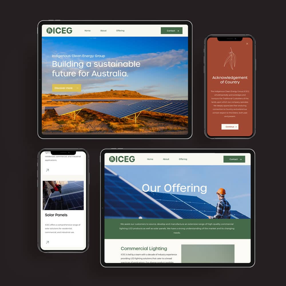
ICEG, a clean energy group founded by Brett Goodes and Michael Rajkumar, is dedicated to a sustainable future for Australia and the empowerment of First Nations people. The client enlisted my help to translate ICEG’s commitment to clean energy and its Indigenous community focus into the new branding.
As a non Indigenous designer, I knew it was crucial to consult closely with Indigenous co-owner Brett Goodes throughout each design aspect to ensure respectful representation of the Indigenous background of the company without misrepresenting or appropriating the culture. With Brett’s guidance and education, we crafted a logo suite and colour palette that paid tribute to the Indigenous aspect of the company.
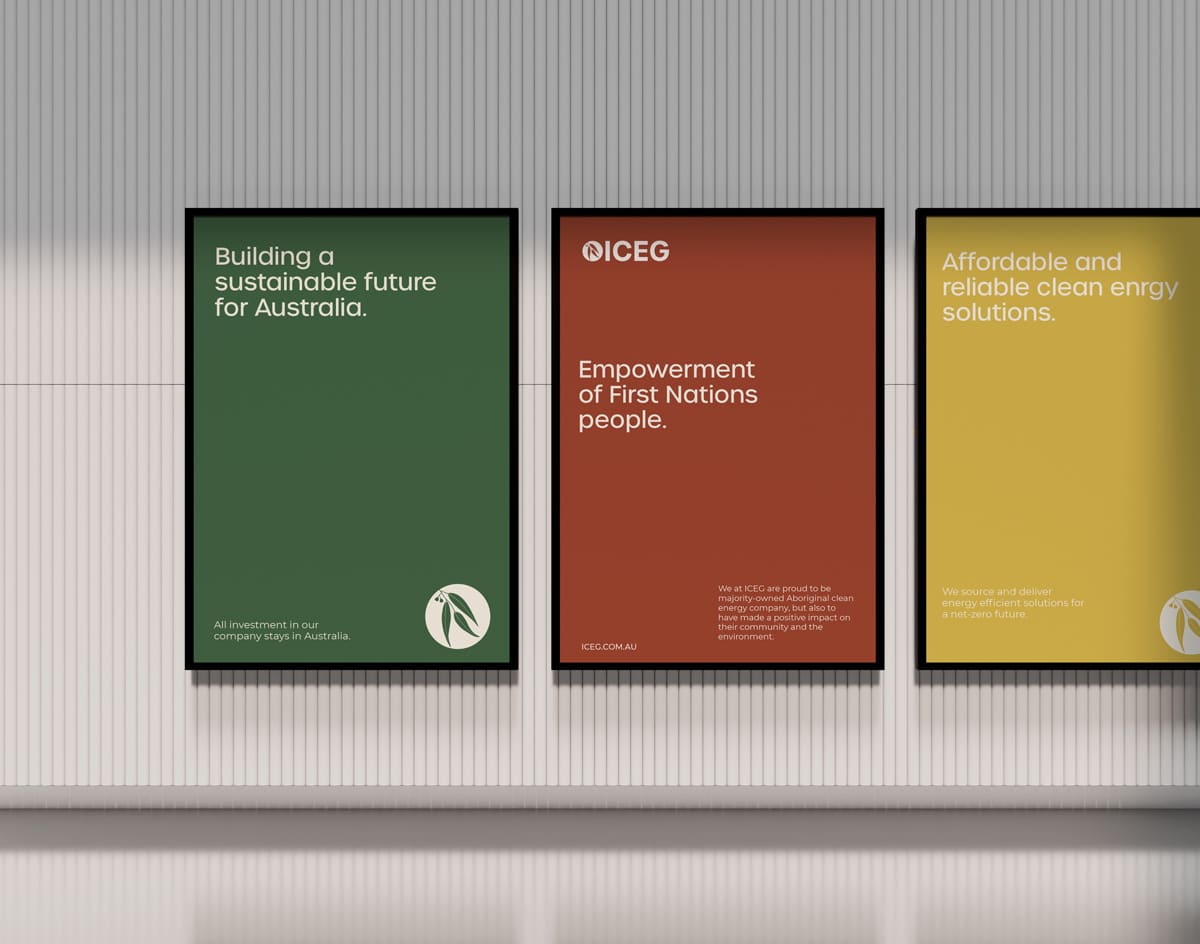
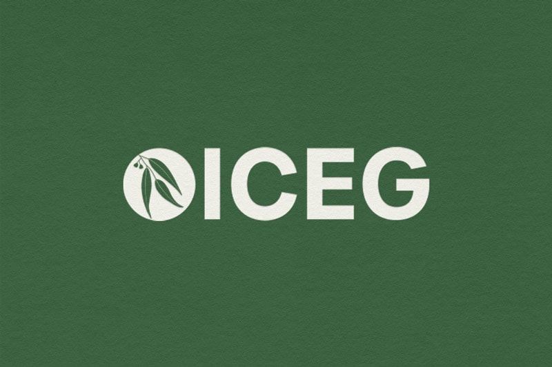
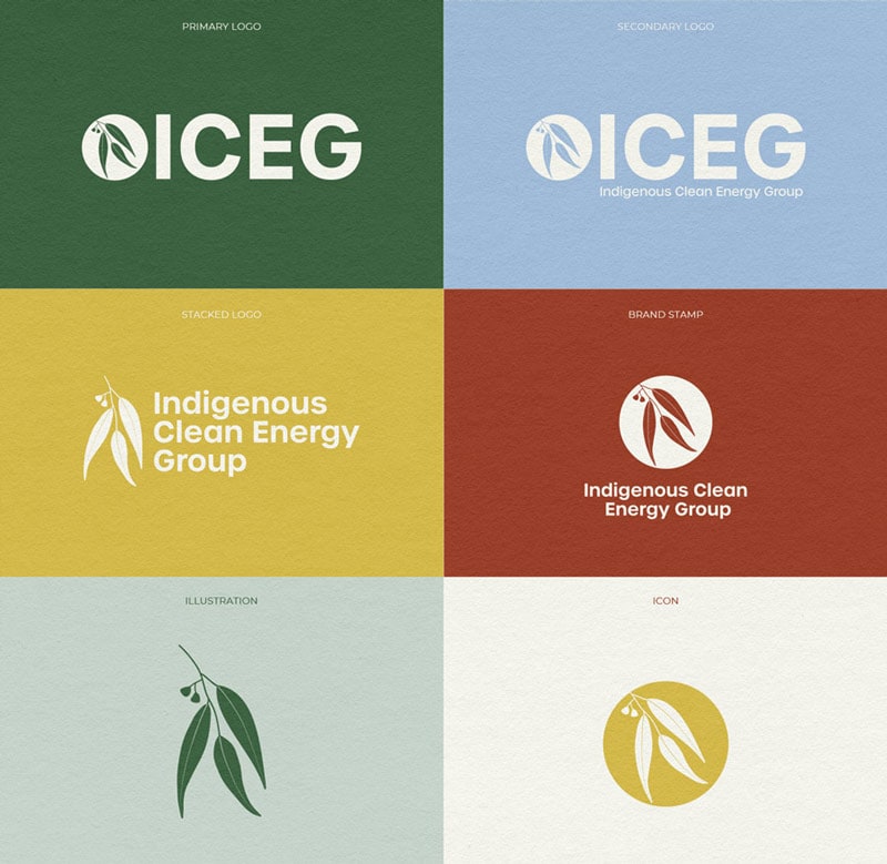
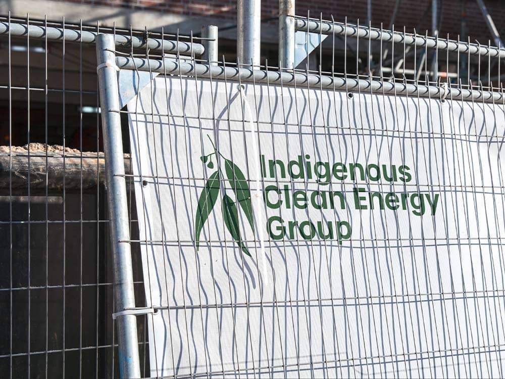
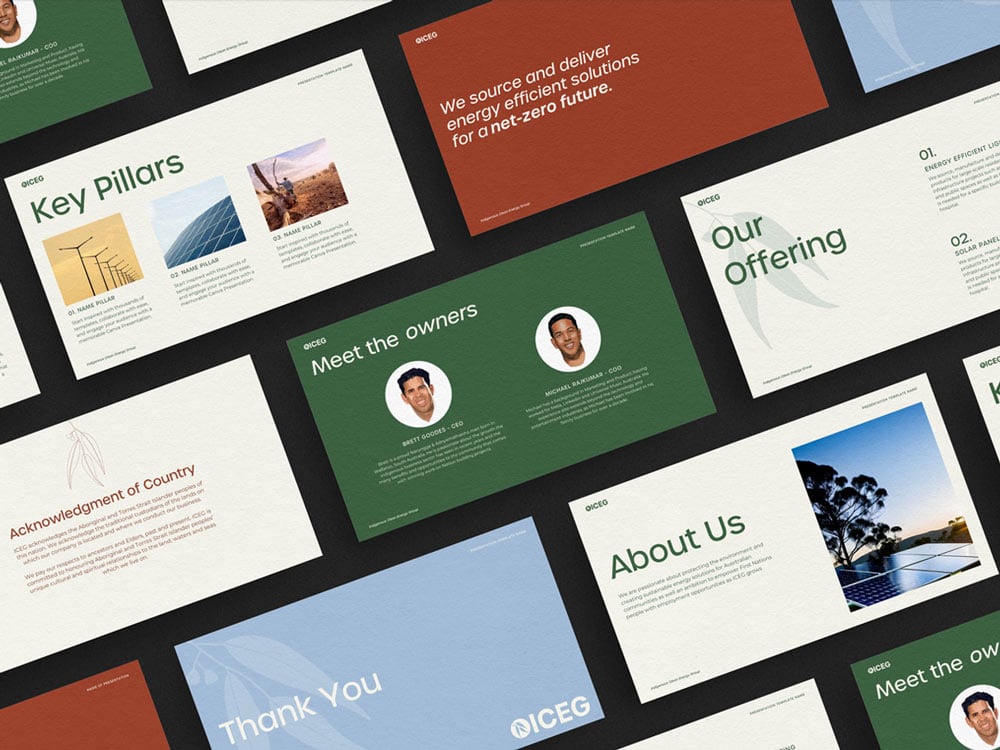
The logo suite is based around the illustration of a juvenile gumnut within a circle, symbolizing both growth, clean energy (the sun), and Indigenous culture. This is furthered in the colour palette as it reflects renewable energy and the natural landscape of the Flinder’s Rangers (where the co-founder is from). These earthy tones have been amplified for a bright, captivating palette befitting a professional corporate brand.
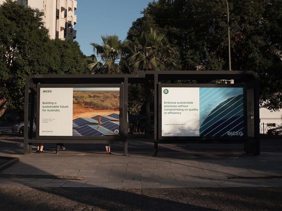
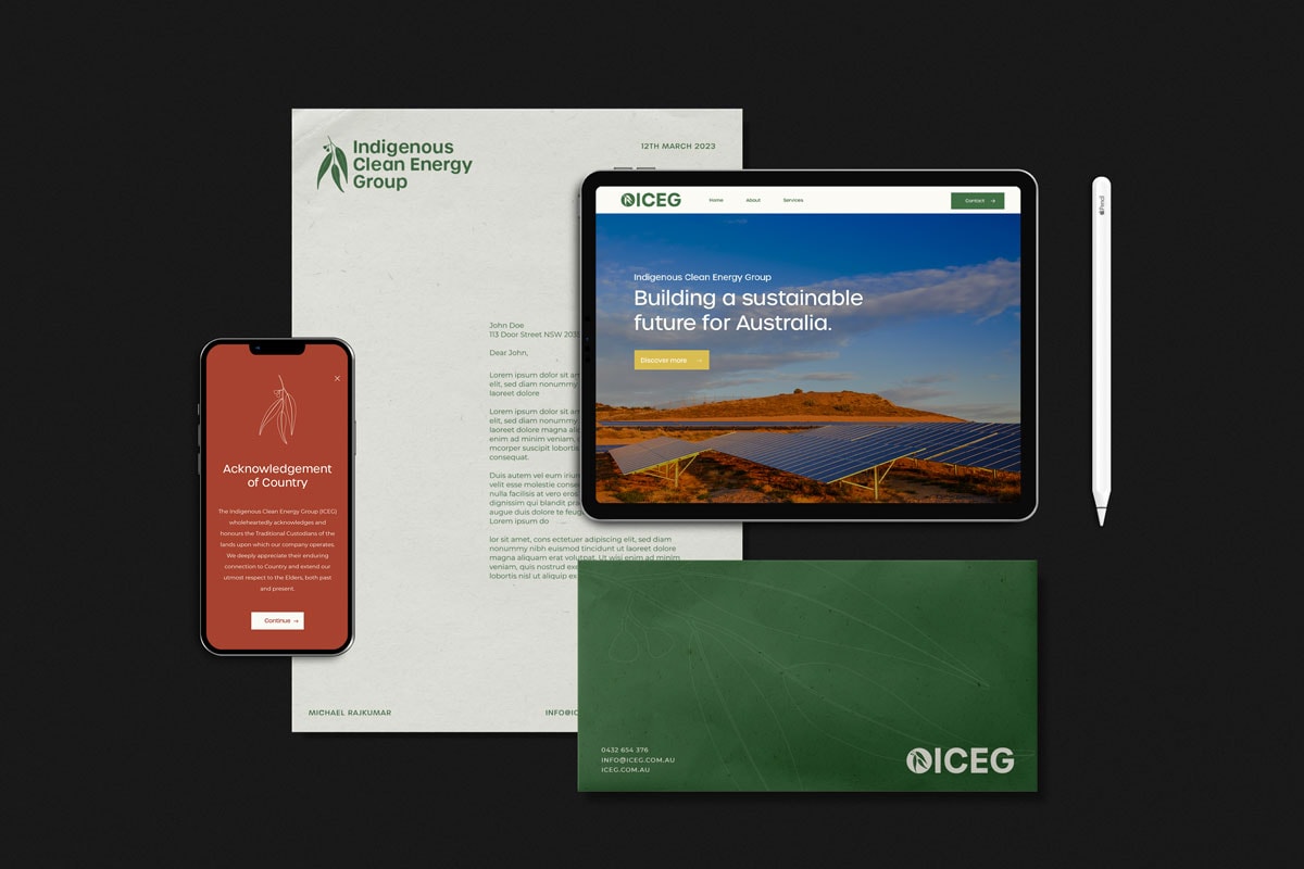
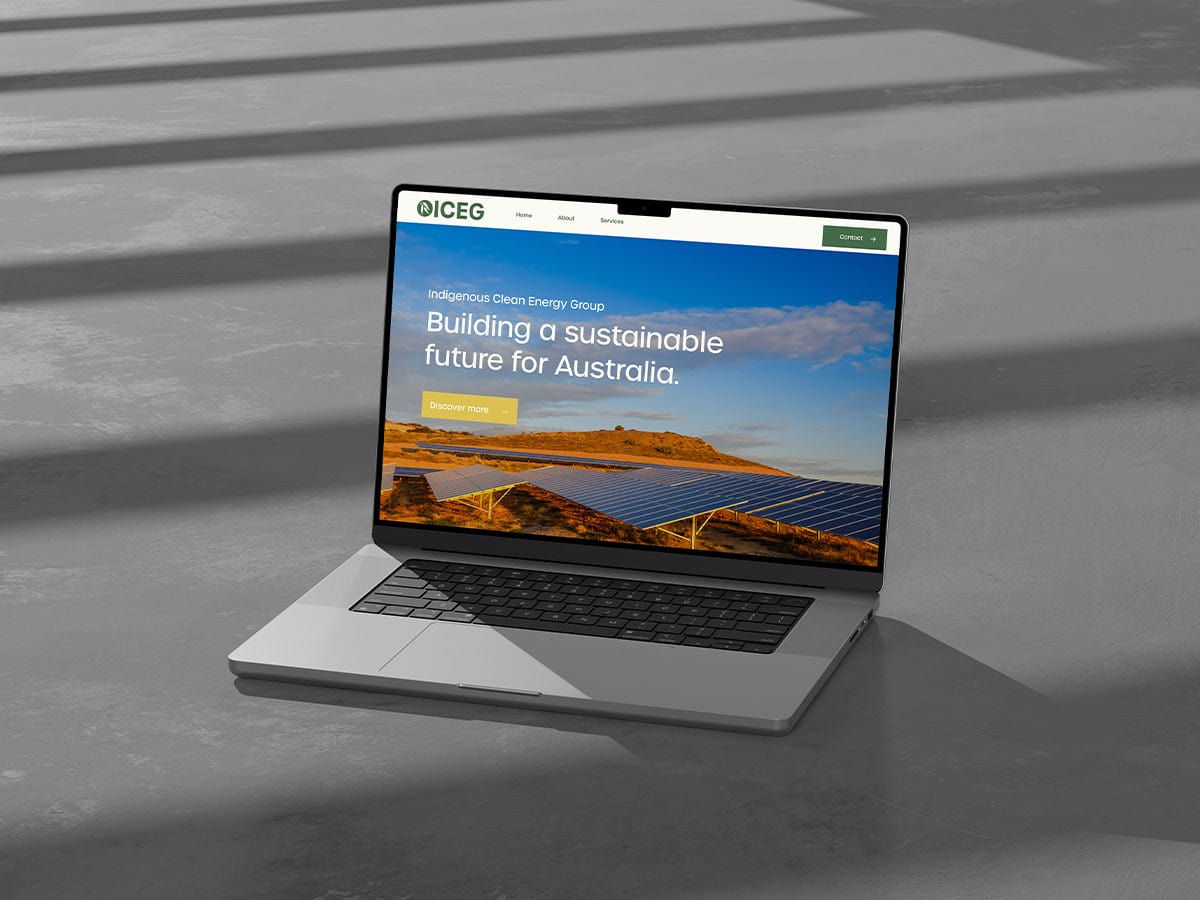
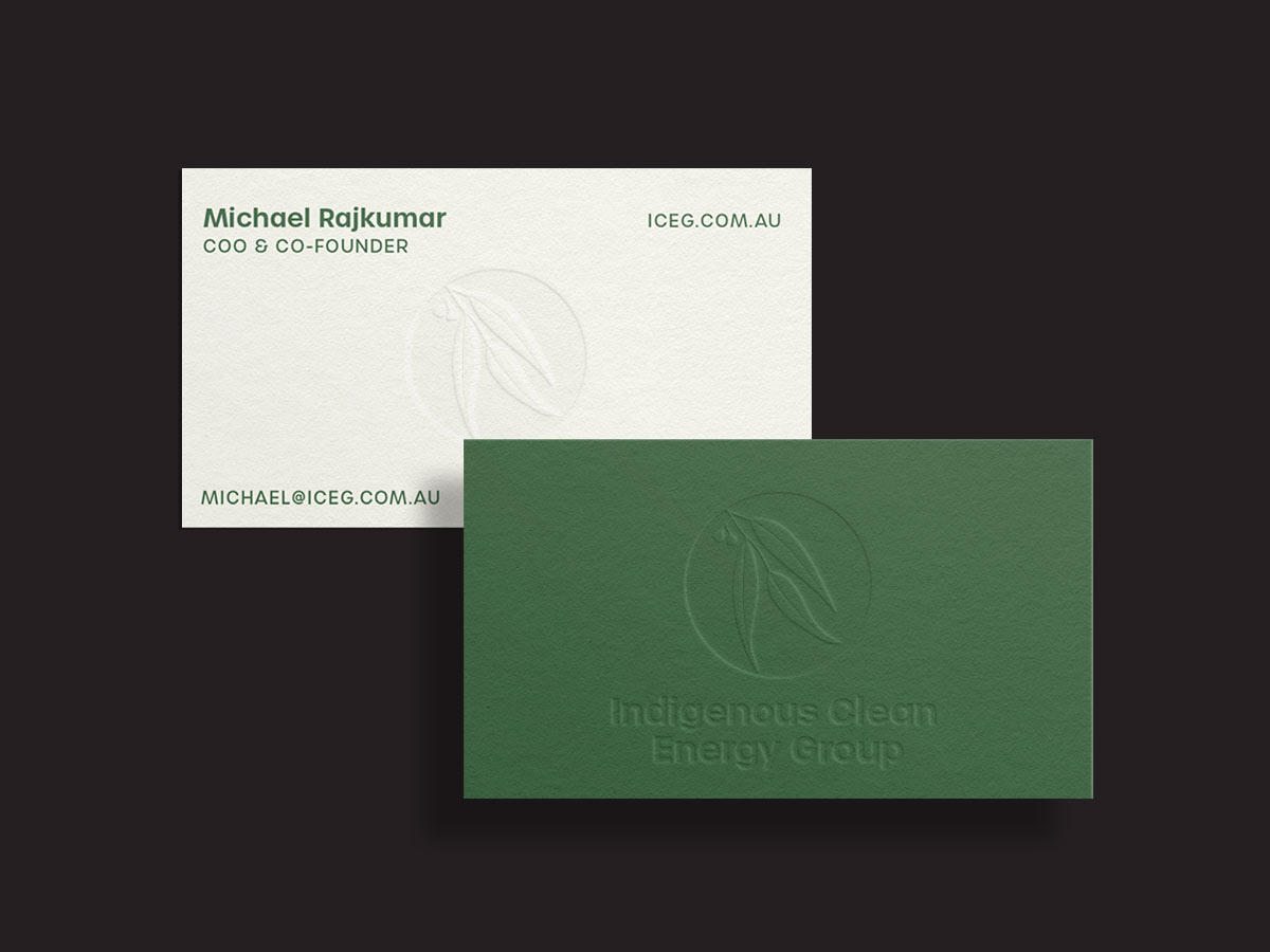
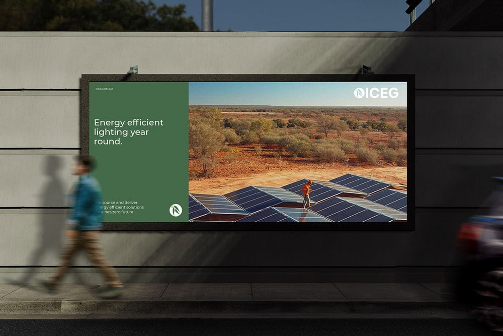
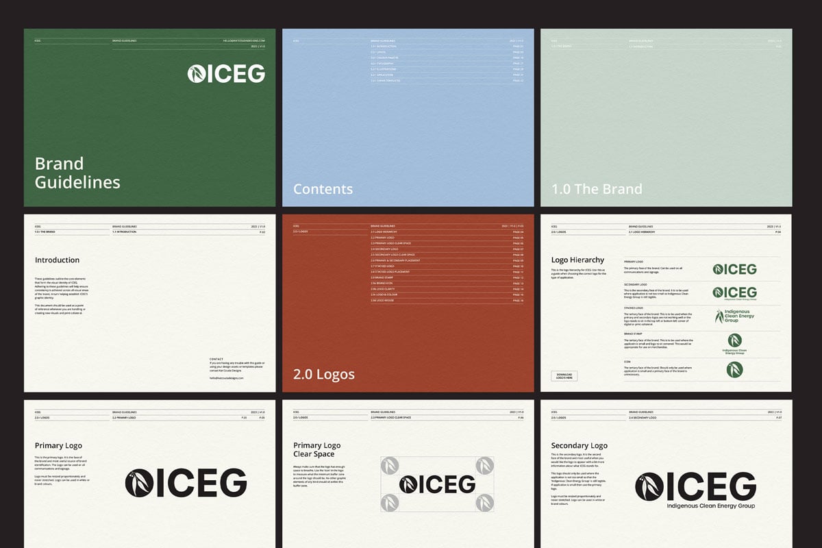
In crafting the type system, I prioritized legibility and simplicity, opting for a rounded sans-serif font to complement the logo’s shapes and evoke a softer, inviting brand aesthetic. Brand guidelines and templates were meticulously crafted to effectively communicate ICEG’s mission and ensure consistency across platforms, bolstering ICEG’s identity in the digital space.

